Planet & Purpose -
built to last
STRATEGY | BRANDING | SEO | WEBSITE DESIGN & MIGRATION

✦ THE CLIENT ✦
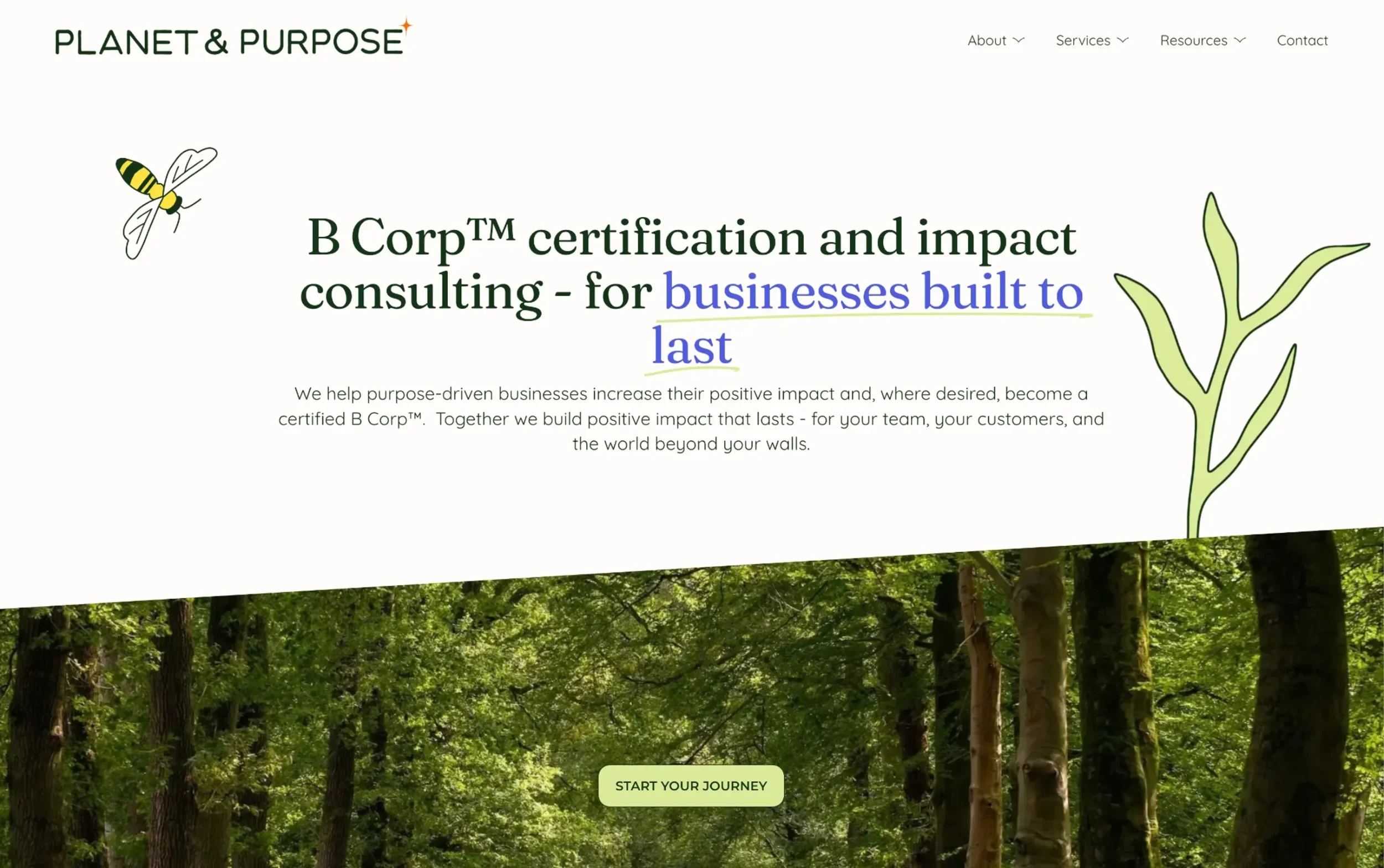
Planet & Purpose, founded by Laura Slack, provides B Corp™ Certification support and impact consulting for SMEs.
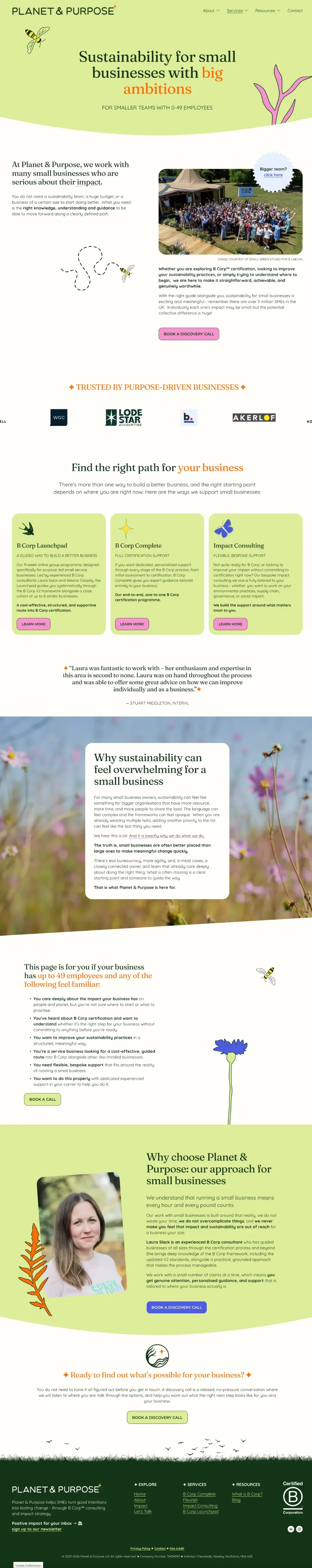
Planet & Purpose helps purpose-driven businesses build positive impact, without the jargon. Supporting businesses at every stage of their impact journey - from embedding better business practices, through to achieving and maintaining B Lab™ certification - Planet & Purpose ensures good intentions turn into lasting change.
THE BRIEF
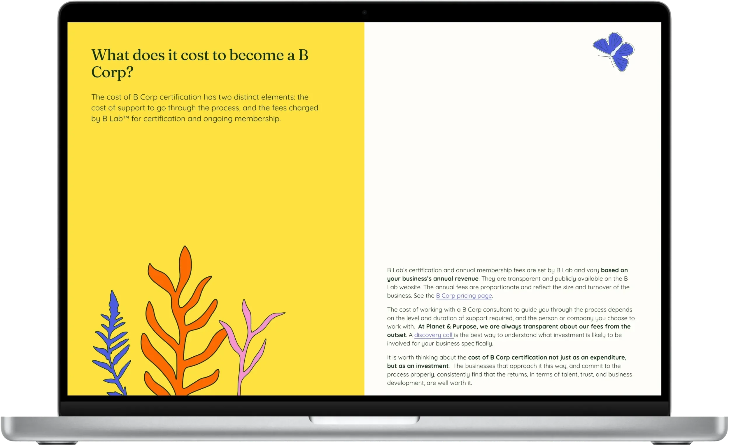
Having worked with Laura on her branding and website before under her previous company name, B Corp™ Expert, Laura came back to me as her business was evolving into its new identity as Planet & Purpose.
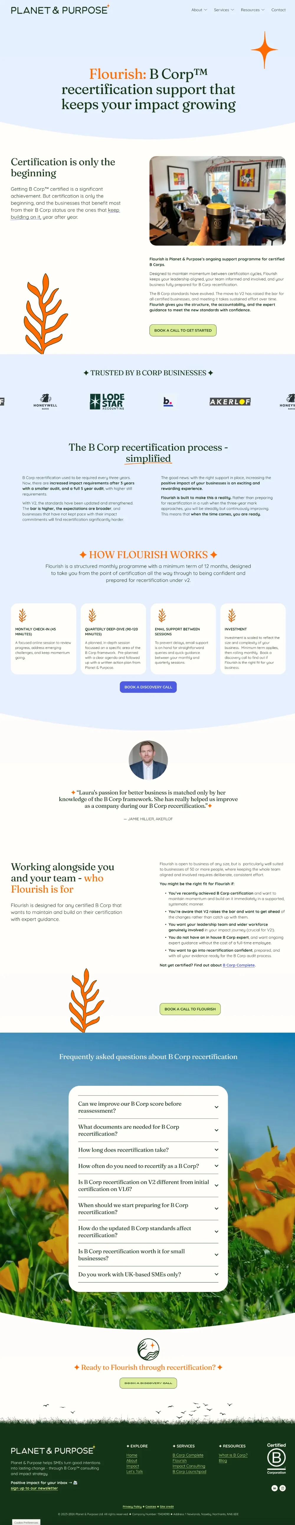
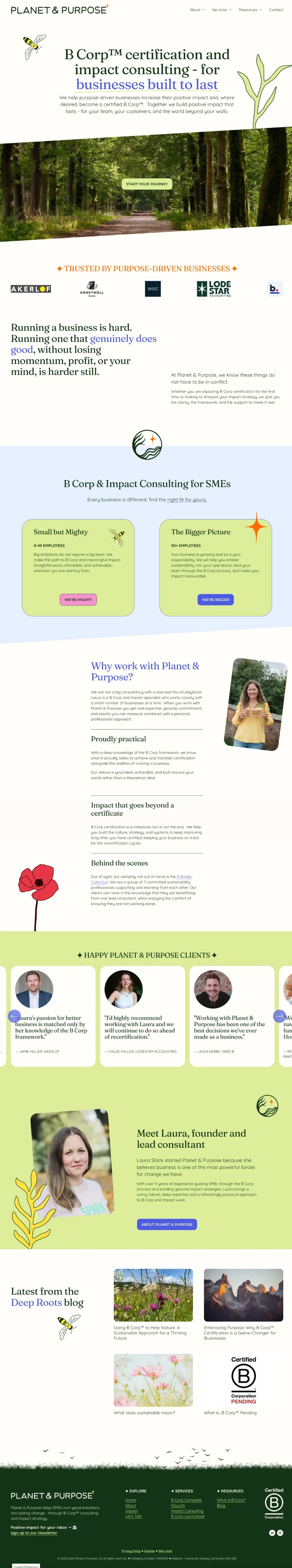
Such a big change required updated brand positioning, a new brand identity, and a new website, whilst moving from Wix to Squarespace.
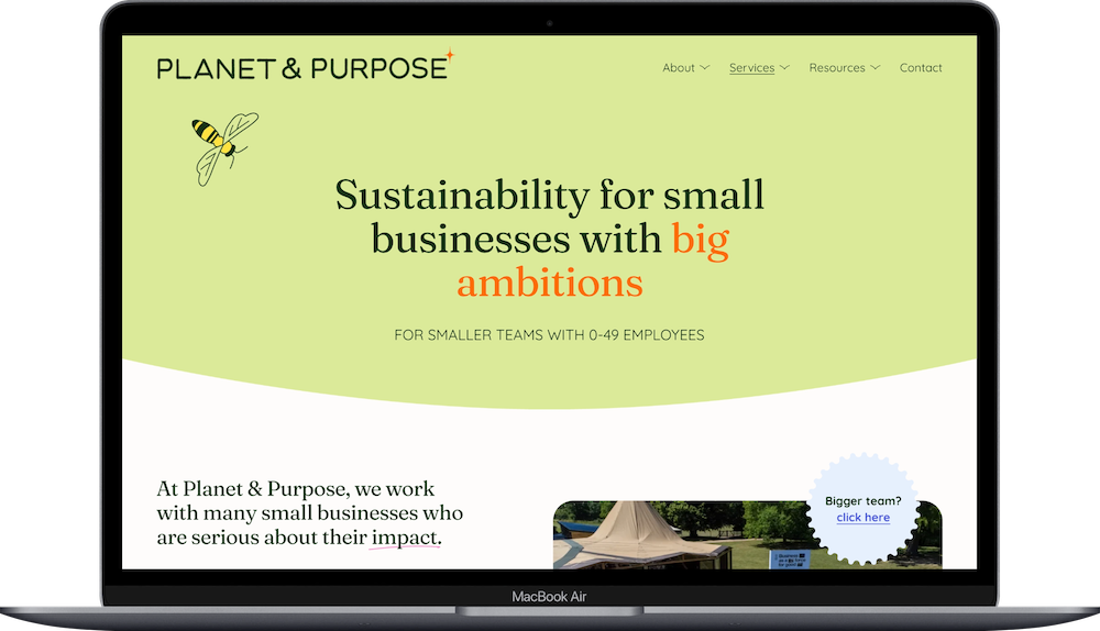
Laura wanted a bolder and brighter look to bring joy and positivity to the sustainability space, and have a distinctive logo mark and brand assets that she could use across her marketing and presentations.
From initial concept…
…to brand in action
Colour Contrast & Accessibility
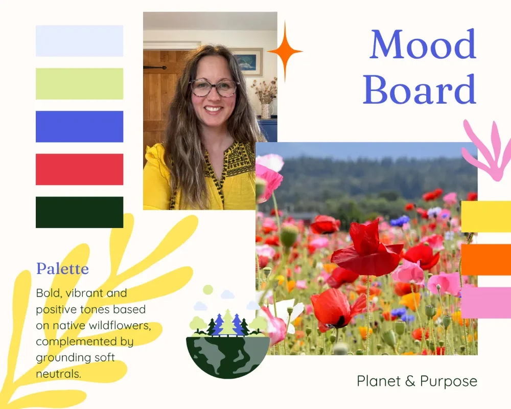
Bringing Laura’s wish of a bright and bold colour palette to life, involved selecting colours that were accessibility friendly and pass the globally recognised Web Content Accessibility Guidelines (WCAG) therefore strong colour contrast was needed for the website text, meeting the highest AAA standard.
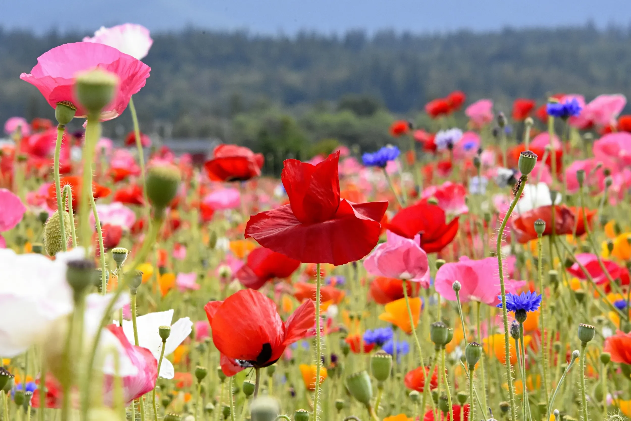
It was important that the colours had that strong connection to nature and didn’t feel synthetic, so I looked to British wildflowers for colour inspiration. From buttercups and field poppies, to marigold and cornflower, all the colours in the Planet & Purpose palette were nature inspired ✦
Final Logo Designs
Logo Mark Concept
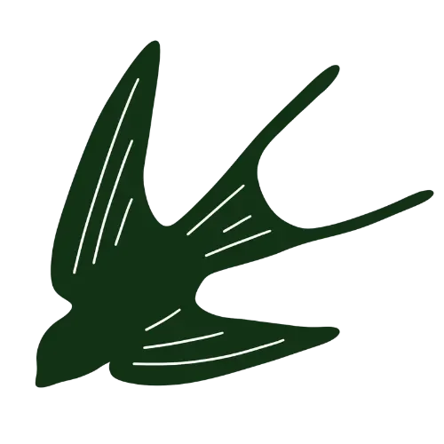
The logo mark tells the Planet & Purpose brand story and is designed to be functional at different scales, requiring a fine balance between meaning and simplicity in a way that strengthens the concept rather than dilutes it.
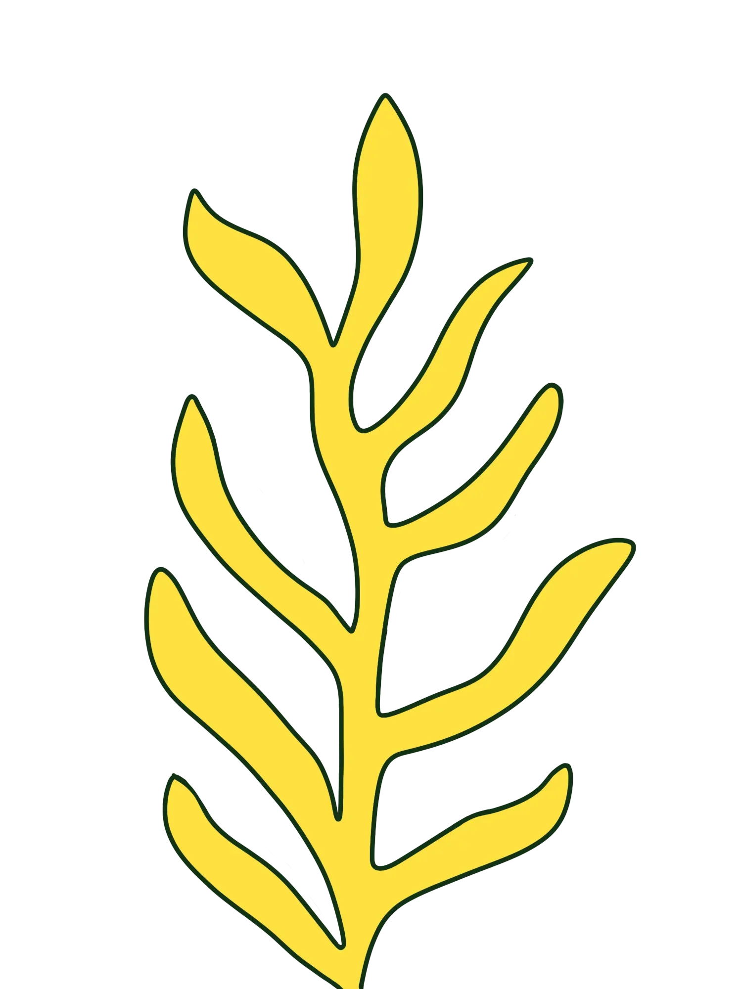
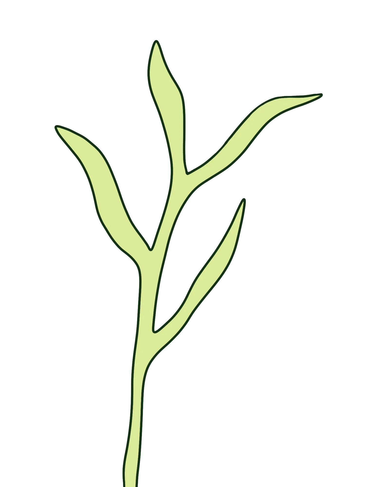
Hand-drawn over several iterations, the brand mark has been born out of elements of the natural world.
The tree and waves representing planet Earth, movement, growth and legacy building - an important concept that came out of our strategy call.
The grounded natural elements have been combined with the ‘North Star’ acting as a beacon and guiding light giving direction and meaning to the purpose of the better business journey companies go on with Laura. Whether that be gaining B Corp certification, recertifying, or designing their own impact strategy.
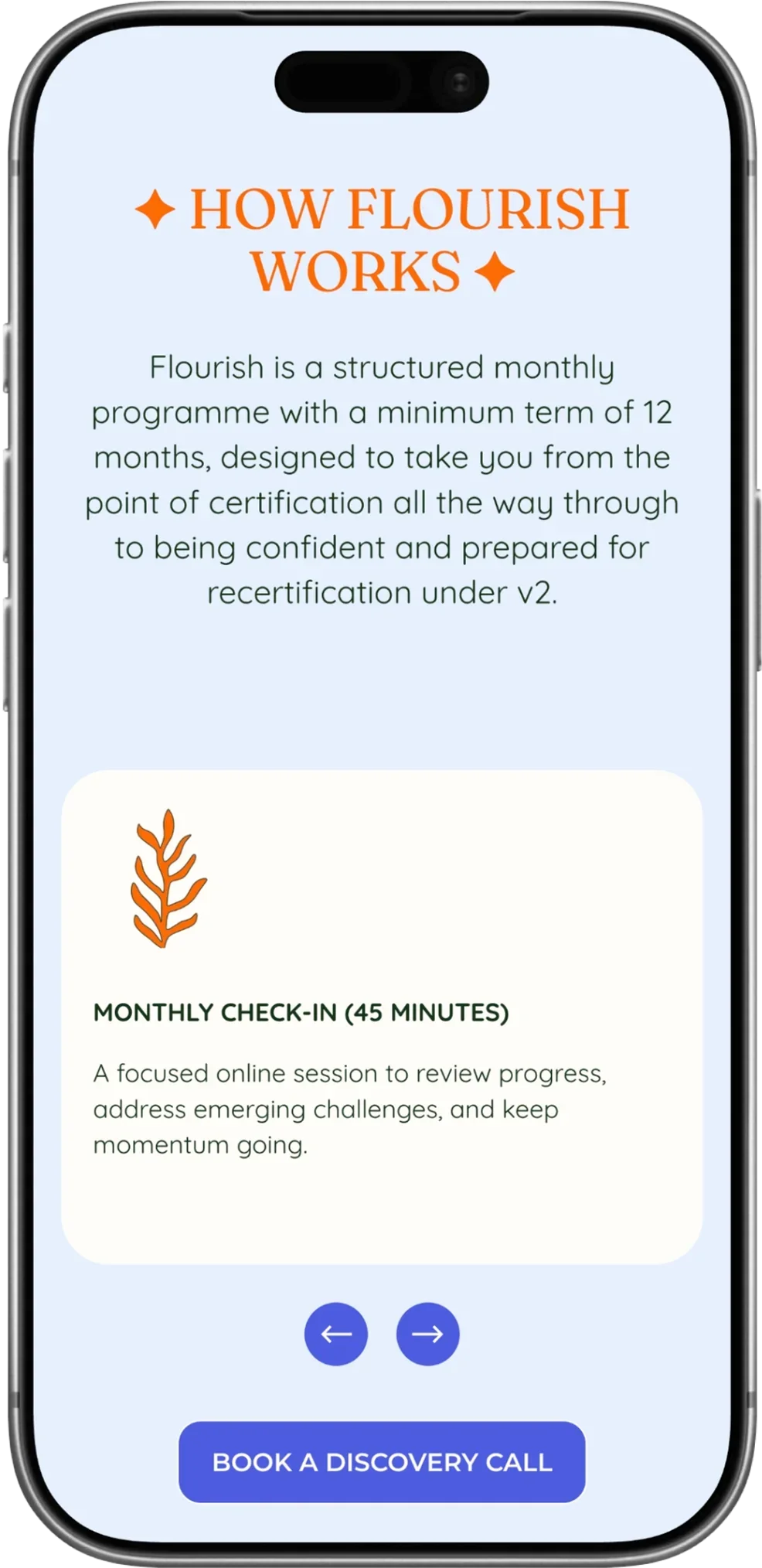
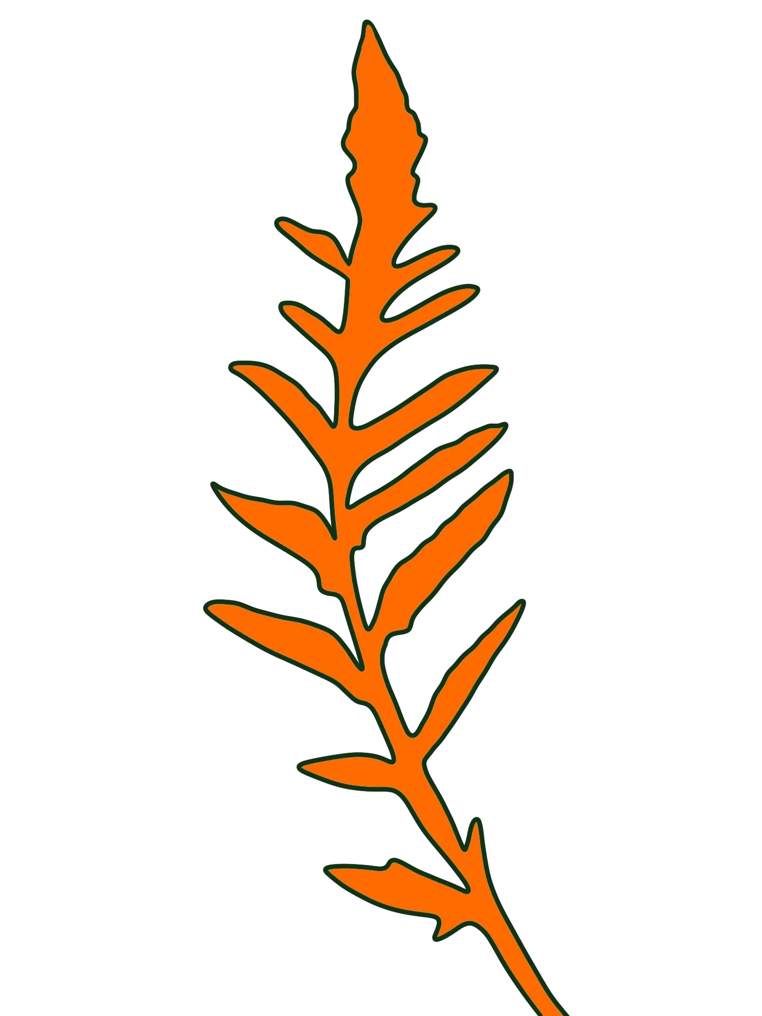
Hand-crafted illustrations
Each illustration was hand-drawn, this was important because our lives are imperfect and our businesses are imperfect too, but that doesn’t mean we can’t work towards improving our positive impact - something that Planet & Purpose stands for.
I was careful in the final rendering of each drawing to not lose those minor imperfections and the evidence of the human hand - the not completely symmetrical star, the minor wobbles in the lines.


“I love the colour palette - it feels more me.”
— LAURA SLACK, PLANET & PURPOSE FOUNDER
READY TO MAKE YOUR OWN WAVES IN THE ONLINE WORLD?

Custom Brand & Web Design
A hand-crafted digital home and resonant brand identity that you can feel proud of and excited to share with the world.